Moooi
Luxury design making playful statements!
So let us start with the basic brand bio to get some background….
Dutch luxury brand Moooi was founded in 2001 by Marcel Wanders & Casper Vissers. The name itself derives from the dutch word for beauty, with extra ‘o’ for uniqueness!
Since it’s original incarnation there have been many management and ownership structures but Marcel Wanders has remained in charge and chief designer all along.
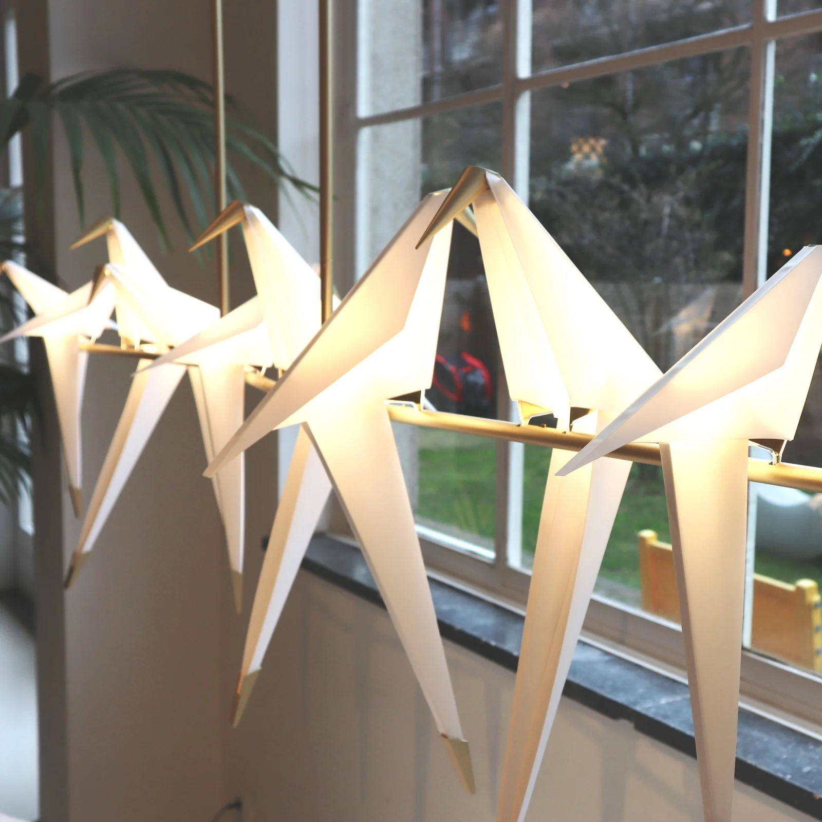
Along with their own unique blend of luxury they showcase pieces by other well established, and equally playful, designers such as Studio Job and Umut Yamac (got to love his Perch lights, seen dotted all over the Moooi showroom).
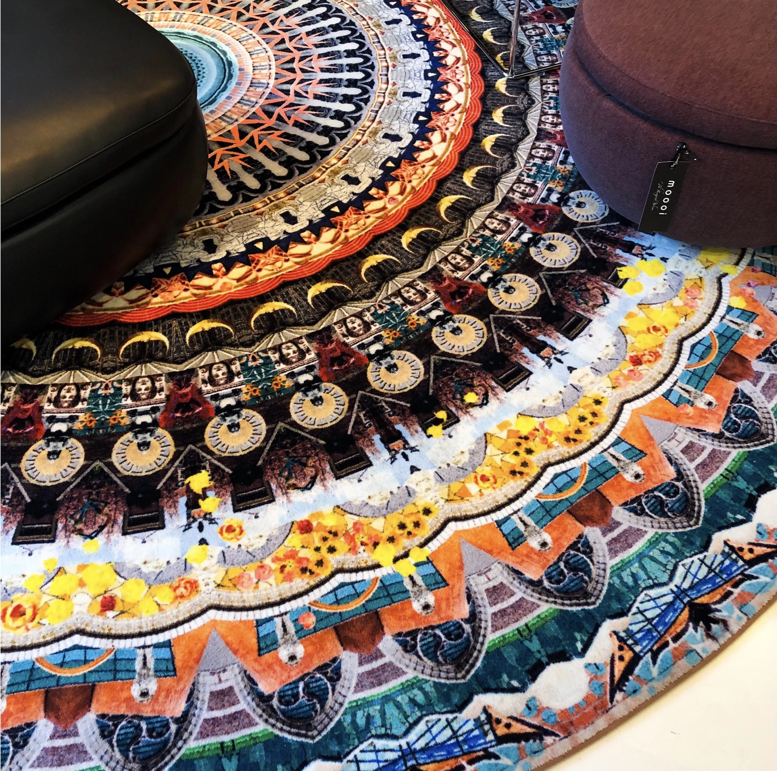
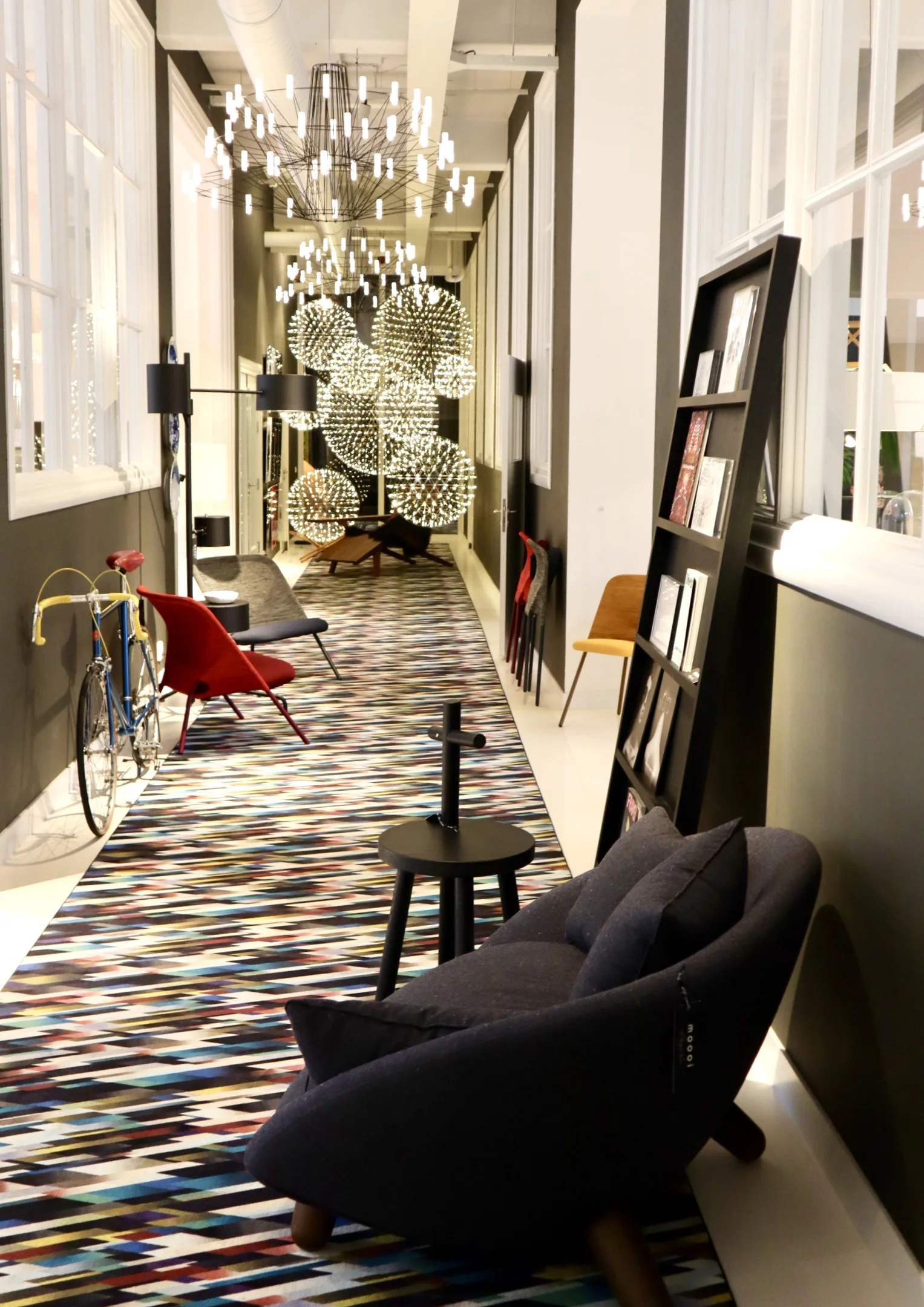
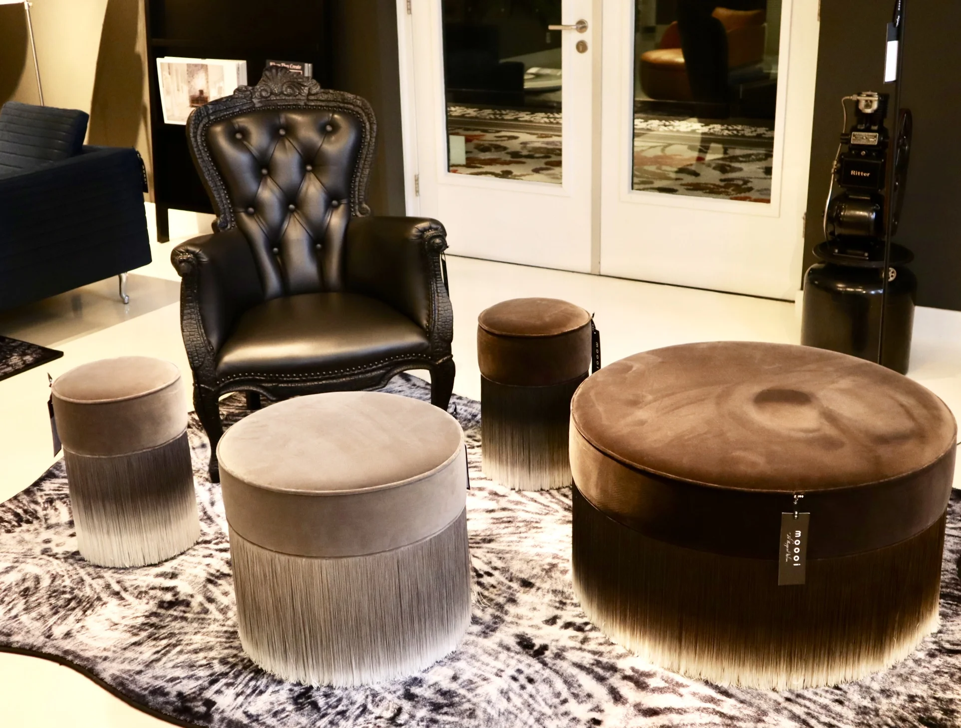
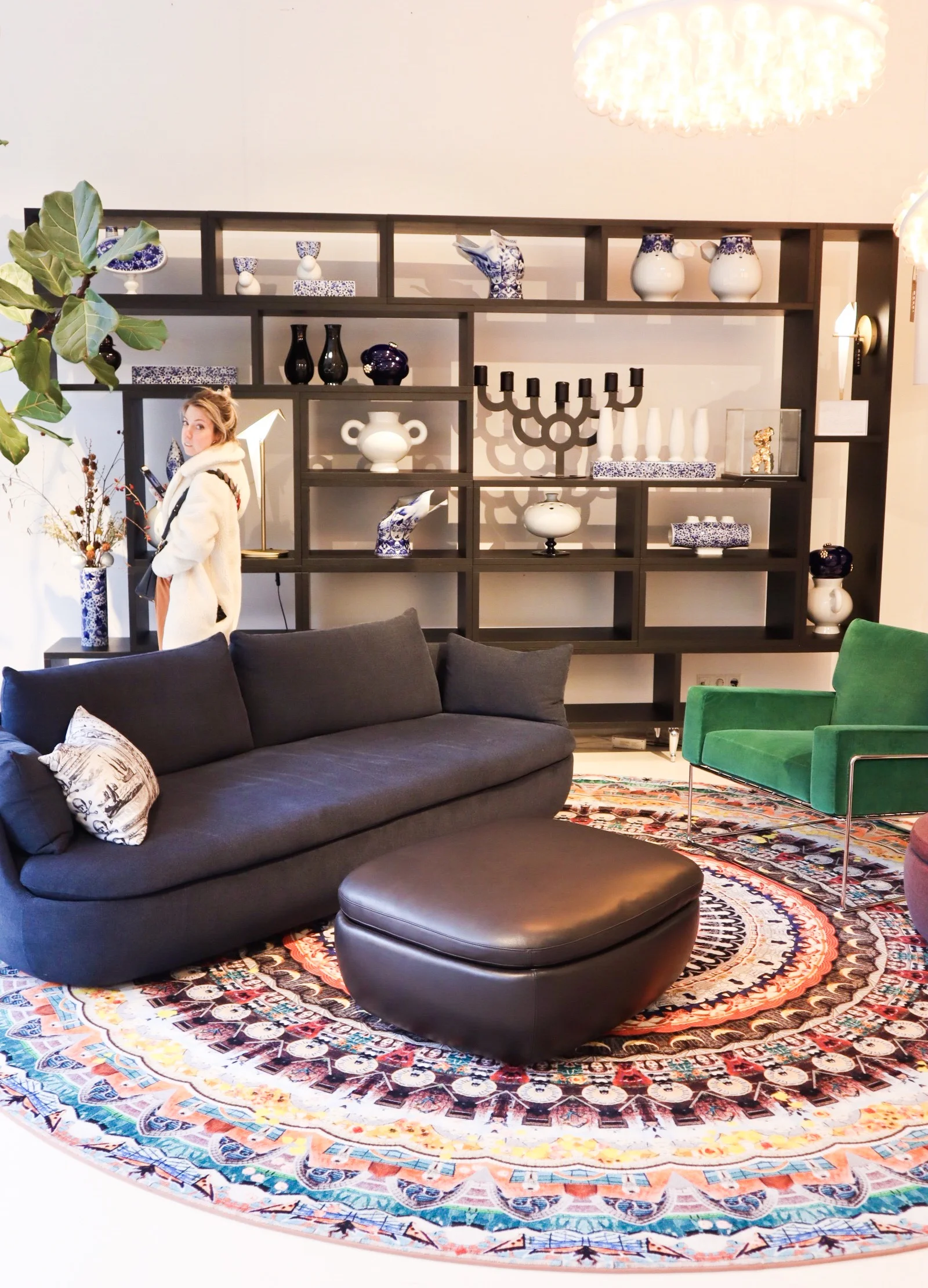
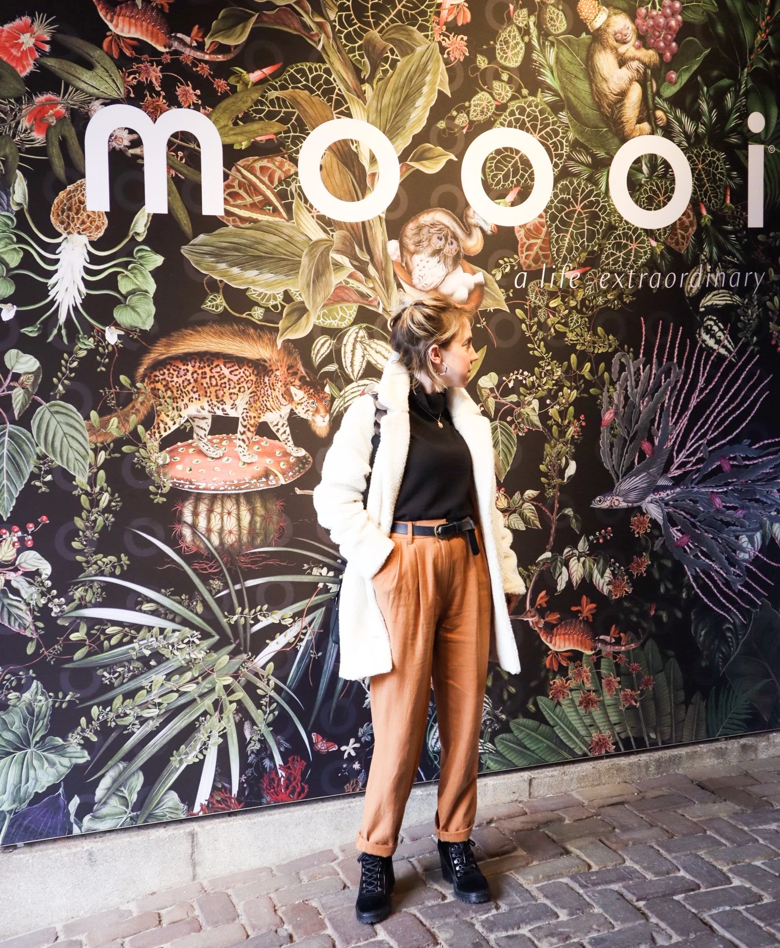
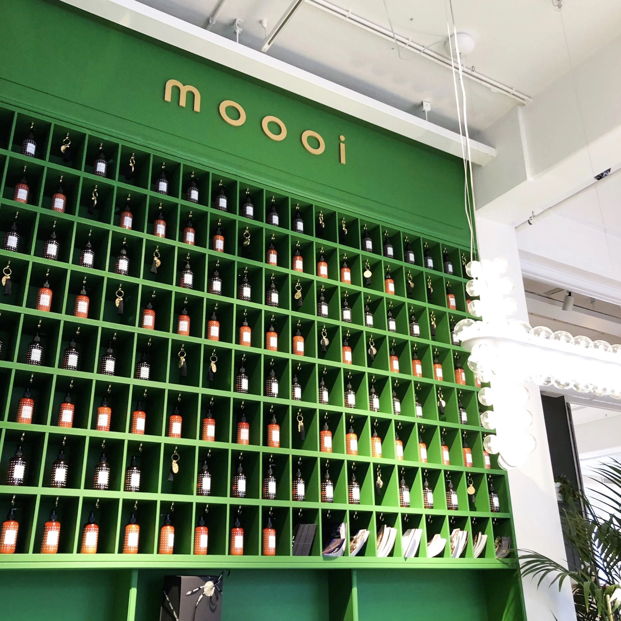
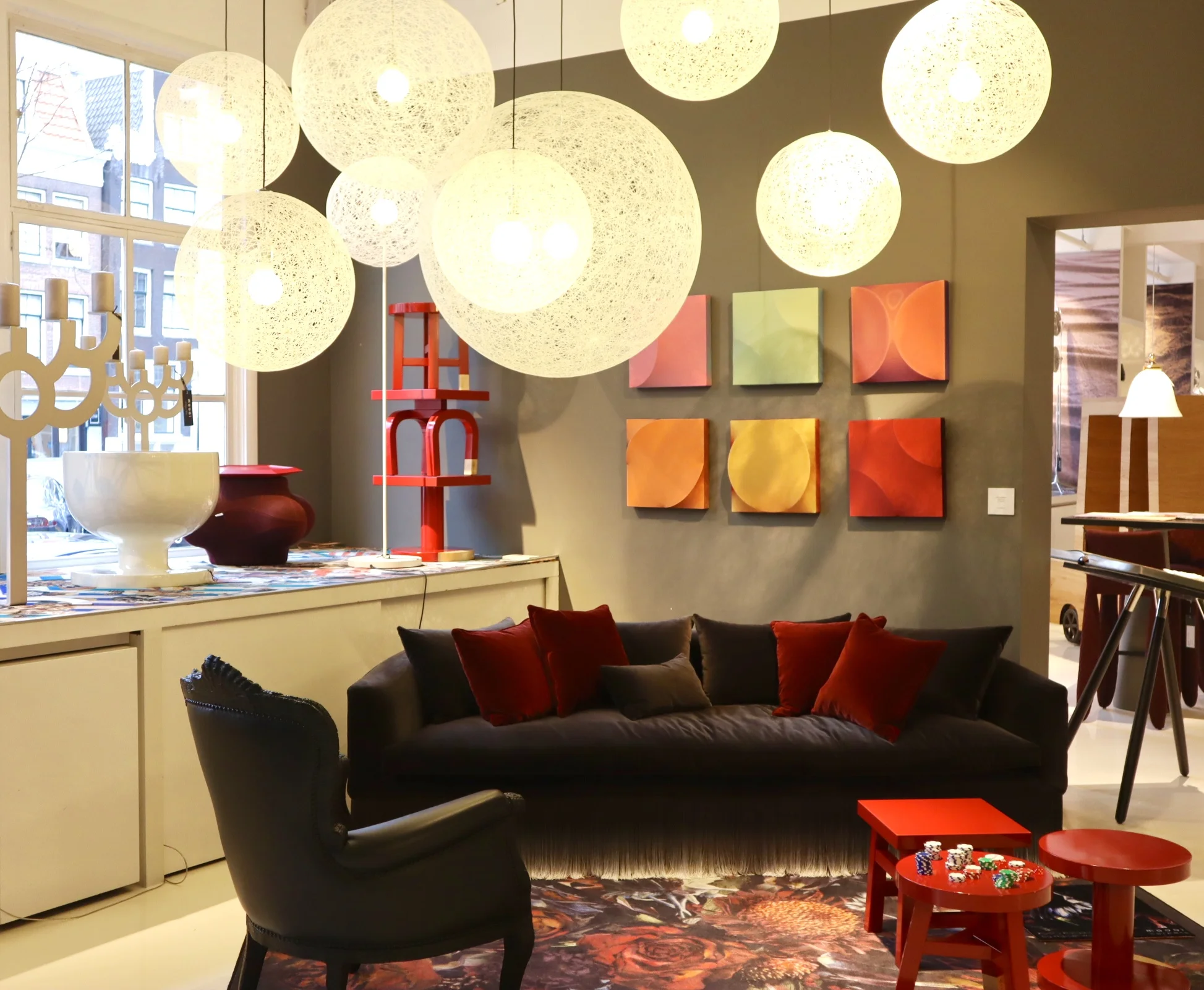
Now let’s talk about how amazing the 700sqft flagship showroom is in Joordan, Amsterdam. It’s a visual grenade from the second you walk in. Even just the carpet that runs from the entrance, leading you in is an explosion of detailed print and bright colour. A common thread that runs throughout the whole showroom, with each intricately staged area featuring some form of bold explosion in the form of a fab rug or carpeted area. I love walking around showrooms like this, they are not only great when you are sourcing for a project but also just for inspiring. It’s so important to keep visually stimulated and to put yourself in to spaces like this as a designer as often as possible. It is so easy to fall into the ‘work’ aspect of the job and get bogged down by specs and the technical areas of a project.
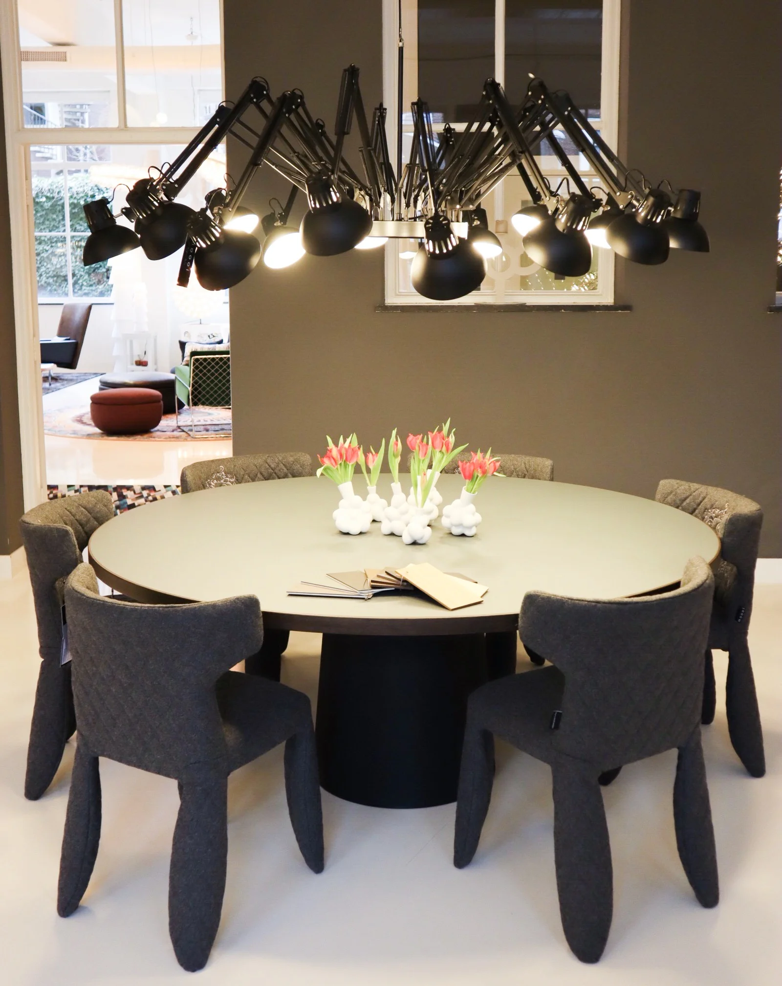
So back to Moooi… the brand is known for quite a few modern iconic pieces. One notable is the Container table with its cylindric pedestal base and simple solid table top. It’s form is simple and modern yet timeless and therefore represents the Moooi ethos perfectly. It comes in an array of sizes and variations on the plain style, such as the New Antiques range that features more curve details reminiscent of old traditional turned table legs. The basic style remains a favourite of mine as it serves as a solid base to allow the accompanying chairs and all other items that occupy the space to shine.
Seen here: a version of the iconic Container table.
Moooi are also synonymous with bold feature light fittings. One of the most iconic are the strong and dominating Paper Chandelier, a modern twist on the classic metal structured chandelier, this is actually created (as the name would suggest) out of paper. Well, the main structure is actually created out of cardboard and wood that is then wrapped in a lacquered paper shell. I would say this is the most iconic light fitting in that most people will have seen one in a quirky commercial setting somewhere or another. It, like many iconic designs, has been copied (or versions/variations attempted) by other high street brands over time too.
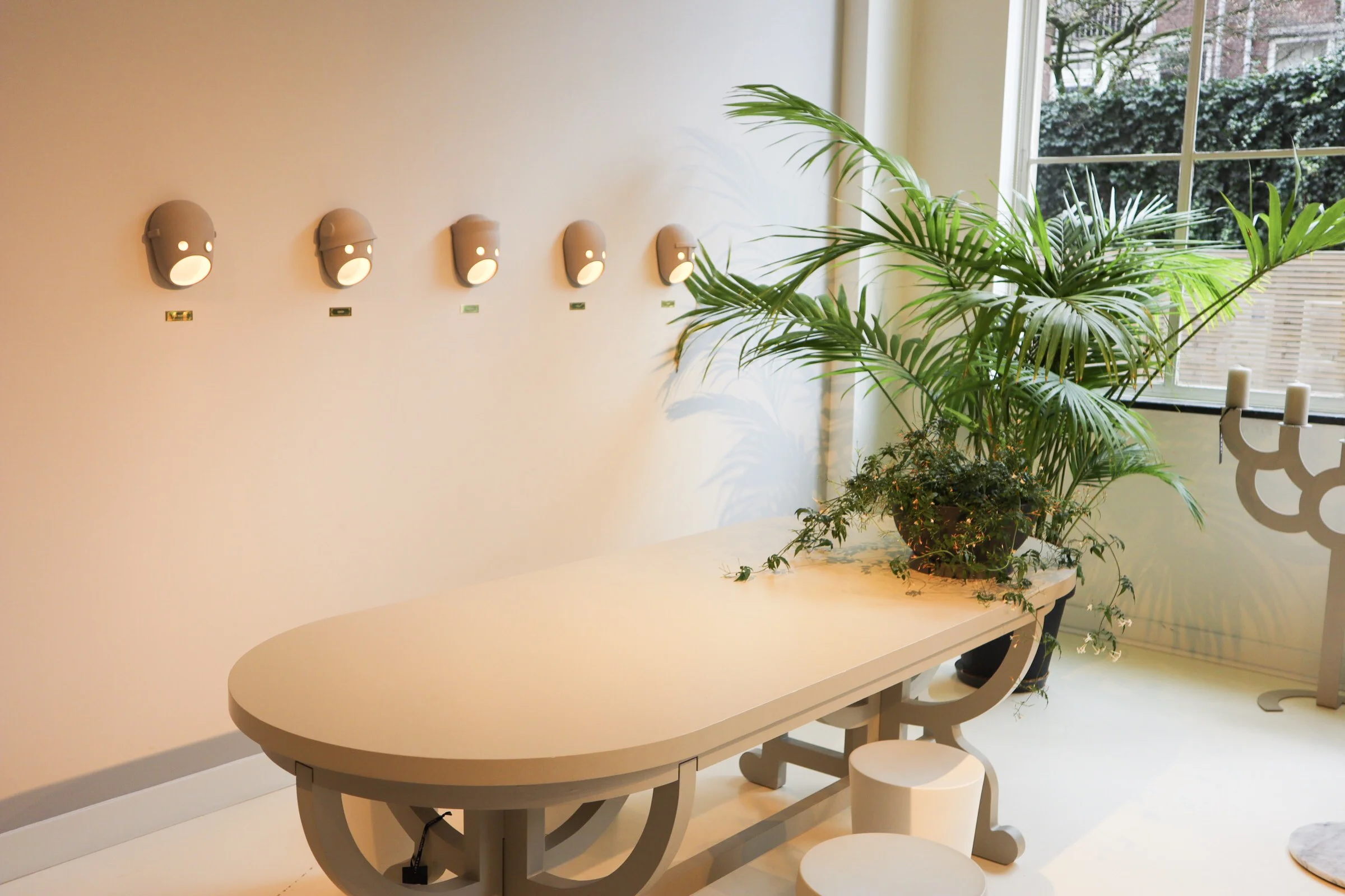
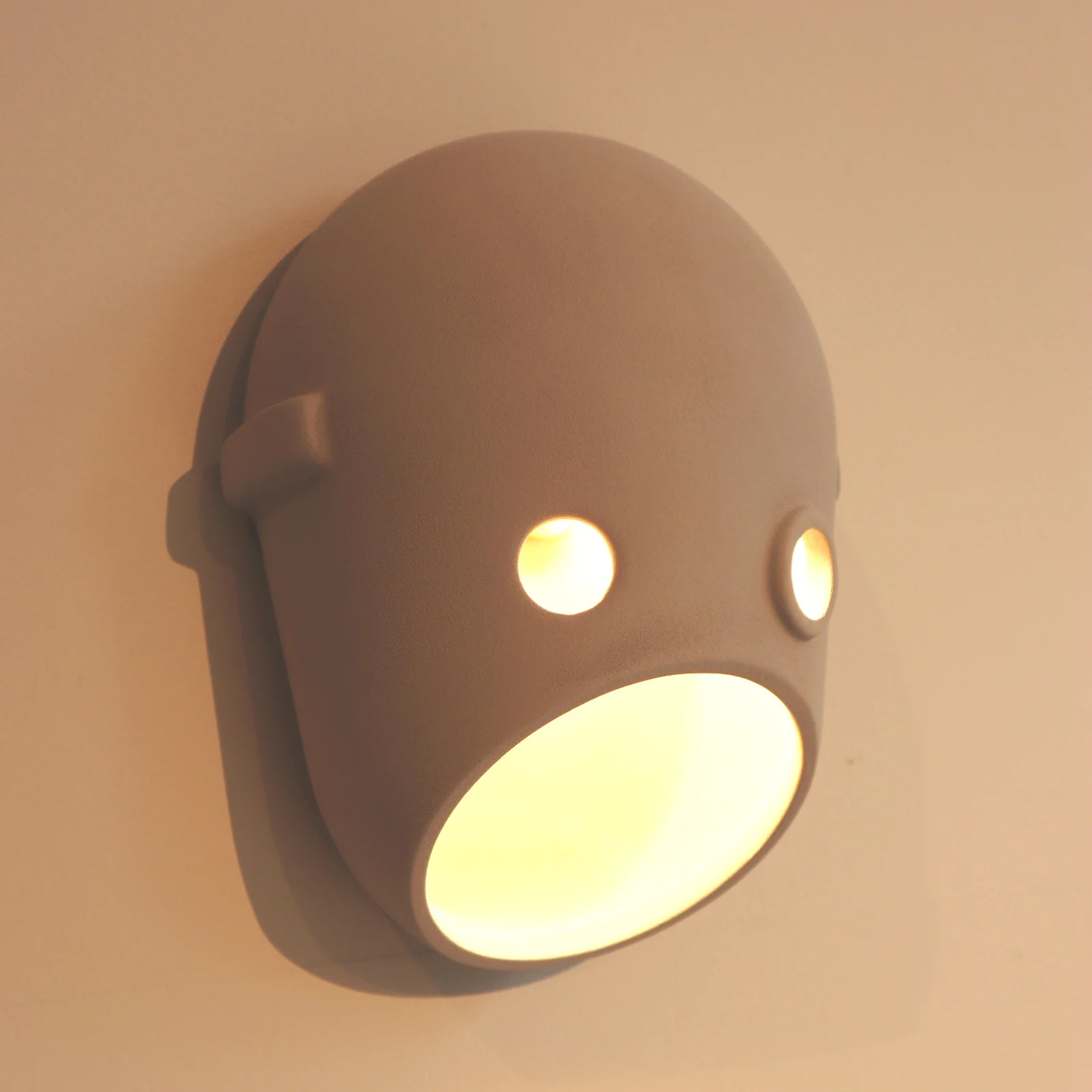
The Paper chandelier is low however on my favourites list when it comes to light fittings at Moooi. The likes of the super cool Meshmatics chandelier with its steel mesh structure edged in brass detail, for a nod to more refined luxe, is right up there. Like I mentioned at the start of this post, you can’t not love the Perch lights by Umut Yamac, seen dotted all over the showroom. But another range that I love, for the sheer fun of it, is the Party. A range of casted ceramic fittings shaped to represent faces. There are a clan of 5 ‘characters’ designed to represent different captivating personalities. The designers say this work is to represent our fascination with secrets, family dynamics and intrigue. The long strip pendant featuring all 5 faces back to back would bring character to any dinner table that’s for sure!
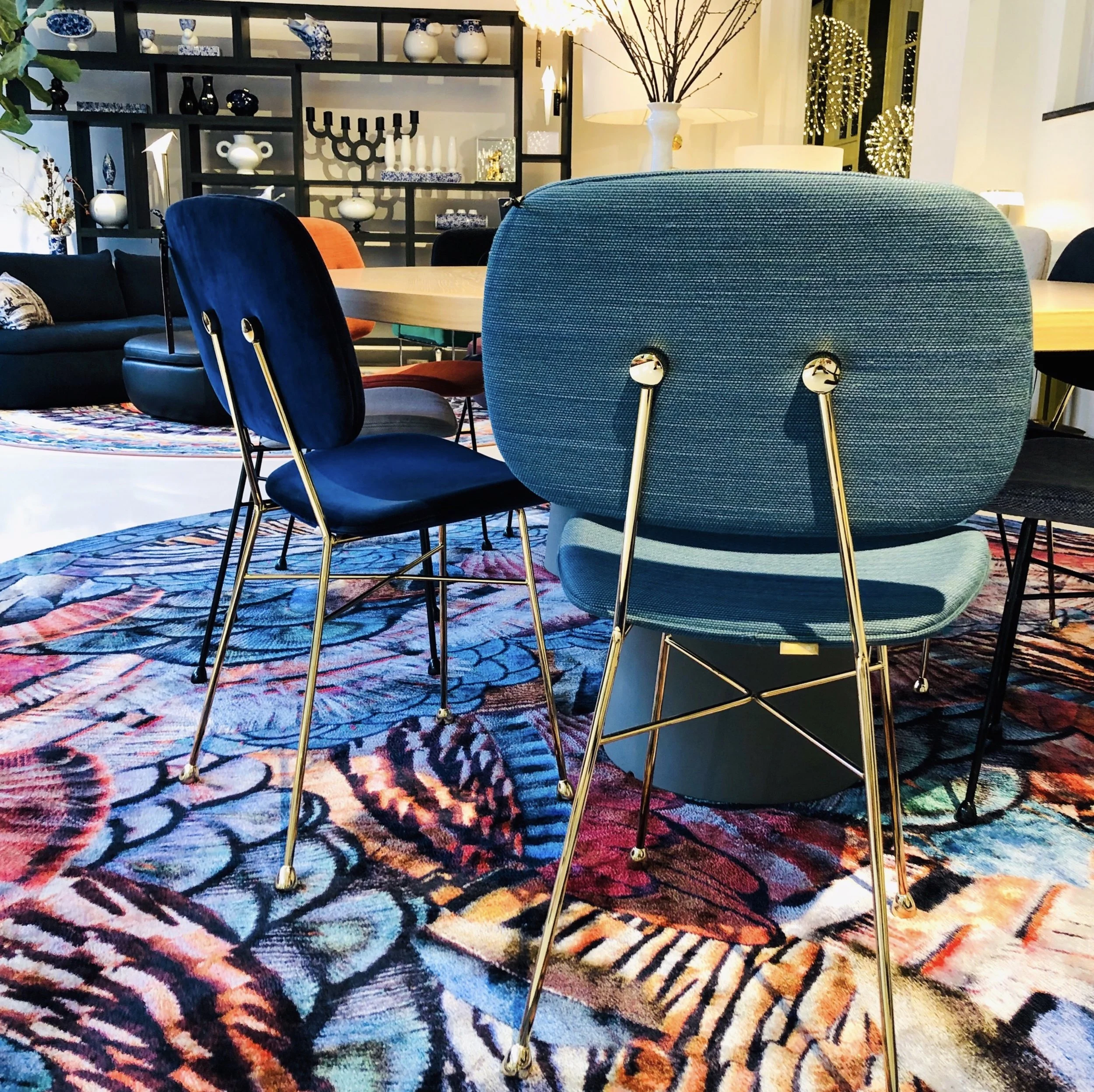
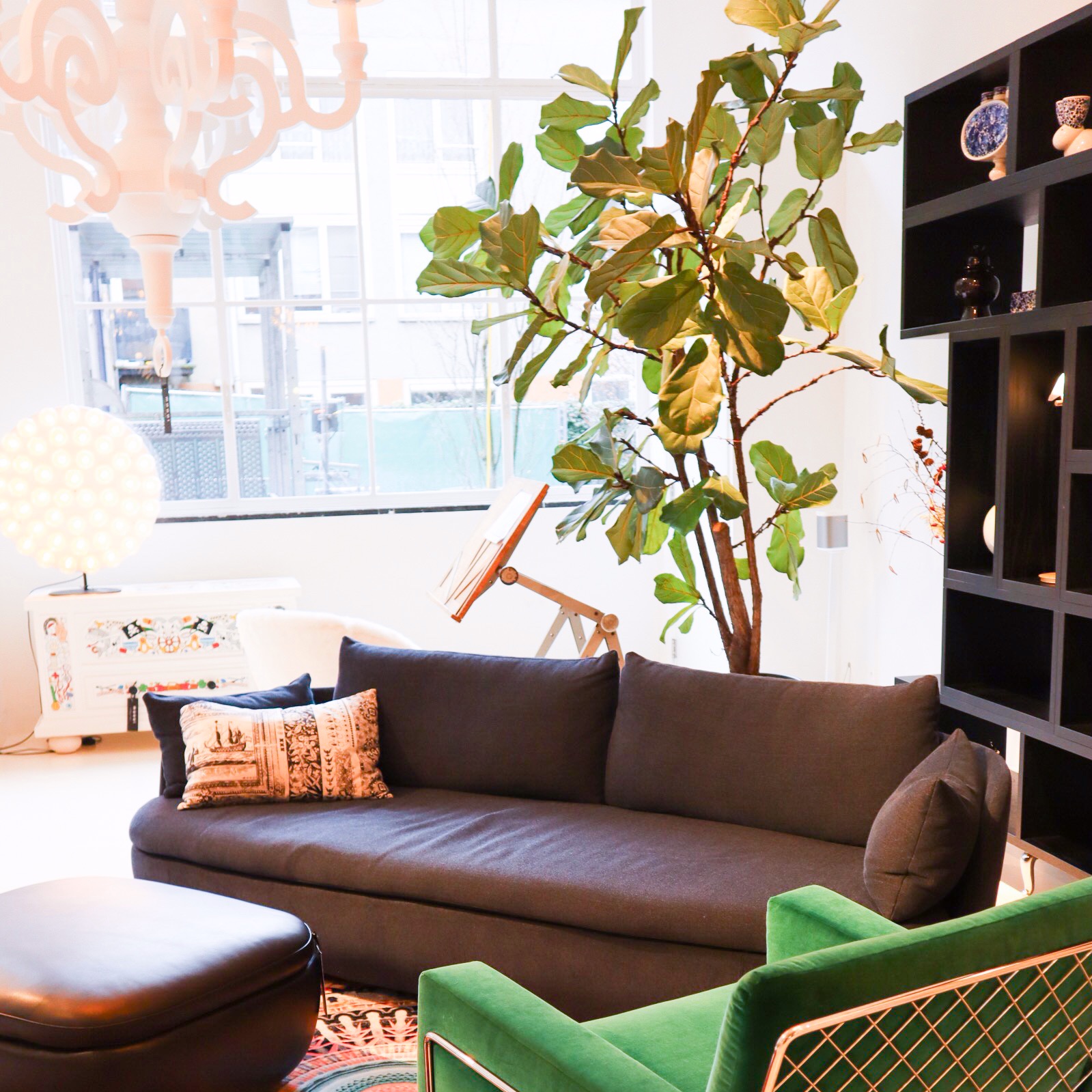
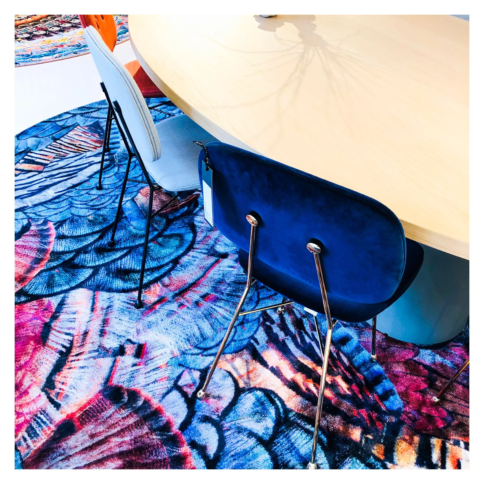
Back to colour and textiles, the various chair styles that dot about the showroom also showcase the continued use of (often) bold colour and with different fabric finishes. The Charles chair a Marcel Wanders design with it’s simple frame base structure is most definitely an iconic piece. It can look strikingly different by the simple change of colour and finish. You will have seen many chairs in companies such as Made.com that have cost definitely been derived from this design. Similar in it’s simplicity is the Golden chair, a simple design based on and reminiscent of a simple school chair but with a fine frame and fab array of finishes. I really love these!!
Area set up - featuring among others - the Charles Chair (in emerald green to the far right), Perch table lamp (on shelving).
They want to be daring but yet timeless, this can perhaps be seen in the most obvious way in pieces like the grandfather clock designed by StudioJob.
Studio Job design Clock.
The whole feel of the showroom is exclusive but without the austerity that that can also harbour. With lots of pattern and colour the space becomes playful and almost poetic, far more inviting than some uber modern show spaces. The brand dictates itself as being position ‘on the edge of commercial reality and cultural interest’ and I think that is about spot on and evident here. Being at the higher end of a retail price point they offer up furnishings that are coveted, yet identifiable at the same time.
In a nutshell, the Moooi style is old meets new in the most modern way, if that doesn’t contradict itself too much?

